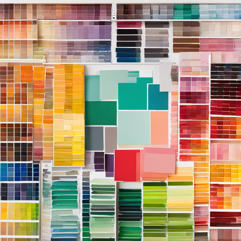
Color matching might seem daunting, especially if you’re a beginner. But fear not! With a few simple tips and tricks, anyone can become a pro at matching colors and creating stylish, harmonious looks. So whether you’re looking to revamp your wardrobe, give your home a stylish update, or simply want to experiment with color, here’s a beginner’s guide to mastering the art of color matching.
When it comes to color matching, a color wheel is your best friend. This handy tool is a must-have for any beginner. It’s a circle that displays all the colors of the rainbow, arranged in a spectrum. With the color wheel, you can easily identify complementary colors (those directly opposite each other on the wheel) and analogous colors (colors that sit next to each other). Understanding these relationships is key to successful color matching.
Let’s start with the basics. The color wheel is composed of 12 main colors, including the three primary colors: red, yellow, and blue. These are the foundation stones as they cannot be created by mixing other colors. Then there are the three secondary colors: orange, purple, and green, created by mixing two primary colors together. Lastly, the six tertiary colors fill up the gaps between the primary and secondary colors, giving us a complete spectrum.
Now, let’s dive into some color schemes. A monochromatic color scheme uses different shades, tints, and tones of a single color. This is a foolproof way to create a sophisticated and elegant look. For instance, try pairing a dark forest green with a soft sage green for a harmonious and cohesive outfit.
Complementary colors are another great option for beginners. As mentioned earlier, these are colors that sit opposite each other on the color wheel, such as red and green or blue and orange. When paired together, they create a vibrant and dynamic contrast that’s sure to catch anyone’s eye. However, be careful not to overdo it, as too much contrast can be jarring.
Analogous colors are also a safe bet for beginners. These are groups of three colors that sit next to each other on the color wheel and naturally look harmonious. Think of peaceful blue and green shades or warm, vibrant oranges and reds. This color scheme is an easy way to add interest and dimension to your look without being too dramatic.
Now, let’s talk about temperature. Colors can be warm or cool, and understanding this distinction is crucial for successful color matching. Warm colors, such as reds, oranges, and yellows, evoke a sense of energy and warmth, while cool colors like blues, greens, and purples give off a calm and soothing vibe. Mixing warm and cool colors can add depth to your look, but be mindful of creating a harmonious balance.
Neutral colors are another essential concept. These include black, white, gray, beige, and navy, and they can be paired with almost any other color. Neutral colors are versatile and can help tone down an outfit or serve as a blank canvas to showcase a bolder color choice. They are a great starting point for beginners, as they provide a safe base to experiment with bolder shades.
Don’t be afraid to add a pop of color to your look. A bold accent shade can completely transform an otherwise neutral or subdued outfit. Try adding a bright scarf, a colorful pair of shoes, or a vibrant lipstick to spice things up. This is a simple way to draw attention and make a stylish statement.
When it comes to mixing patterns, color matching becomes even more important. The key is to ensure that the colors within the patterns complement each other. For instance, pair a floral dress with a cardigan that picks up one of the accent colors in the floral print. This will create a cohesive and well-put-together ensemble.
For beginners, it’s a good idea to stick to one colorful item per outfit. This could be a statement coat, a bright pair of trousers, or a colorful blouse. By focusing on one colorful piece, you can ensure that it stands out and that your overall look remains balanced.
Accessories are another great way to add color to your look without overwhelming your outfit. A colorful bag, a bright silk scarf, or even a pair of colorful earrings can elevate your style and showcase your color-matching skills.
If you’re unsure about which colors go together, nature is an excellent source of inspiration. Look at the colors of a sunset, the hues of a flower garden, or the shades of the ocean and use them as a guide for your color choices. Nature rarely gets it wrong!
When in doubt, stick to classic color combinations that have stood the test of time. For example, a crisp white shirt with navy trousers or a black dress with a red lip are timeless and elegant choices that never go out of style.
Practicing color matching doesn’t have to be boring. Get creative and experiment with different color combinations in your free time. Try creating mood boards or playing around with color palettes online to refine your eye for color.
Lastly, don’t be afraid to break the rules! Color matching is a creative process, and sometimes the most unexpected combinations can yield stunning results. So, have fun, trust your instincts, and you’ll be a color-matching pro in no time!
We hope this beginner’s guide to color matching has inspired you to embrace color and incorporate it into your wardrobe and life. Remember, color matching is a skill that anyone can master with a bit of knowledge and practice. So, go ahead and inject some color into your world!
